MOM 360
MOM 360
MOM 360
User Experience Design and Branding
User Experience Design and Branding
User Experience Design and Branding


Project Overview
Project Overview
Mom 360
Mom 360 is a platform designed to support, celebrate, and empower moms. It offers courses and personalized coaching to teach moms practical skills in the areas of parenting and physical, emotional, and financial well-being.
This project is an end-to-end responsive website redesign with an AI-powered recommendation chatbot to help moms find the help they need quickly.
Mom 360 is a platform designed to support, celebrate, and empower moms. It offers courses and personalized coaching to teach moms practical skills in the areas of parenting and physical, emotional, and financial well-being.
This project is an end-to-end responsive website design with an AI-powered recommendation chatbot to help moms find the help they need quickly.
Mom 360 is a platform designed to support, celebrate, and empower moms. It offers courses and personalized coaching to teach moms practical skills in the areas of parenting and physical, emotional, and financial well-being.
This project is an end-to-end responsive website redesign with an AI-powered recommendation chatbot to help moms find the help they need quickly.
The Product
Responsive website (in development)
My Role
UX research | Branding | UX/UI design
Testing
Duration
12 weeks
The Product
Responsive website
(in development)
My Role
UX research
Branding
UX/UI design
Testing
Duration
12 weeks
Research and Problem Definition
Research and Problem Definition
Research Plan
Research Plan
I put together a research plan to get aligned on the timeline and expectations for the discovery phase with the Mom 360 team.
I put together a research plan to get aligned on the timeline and expectations for the discovery phase with the Mom 360 team.

Research Hypothesis
Research Hypothesis
Moms need inclusive, encouraging, and positive content that will support them in all areas of their lives.
Moms need inclusive, encouraging, and positive content that will support them in all areas of their lives.

Research Goal
Research Goal
Determine the challenges moms face so that we can determine what content to offer.
Determine the challenges moms face so that we can determine what content to offer.
Research Methods
Research Methods
Competitor Analysis
Competitor Analysis
User Survey
User Survey
Mom Expert Interviews
Mom Expert Interviews
Synthetic User Interviews via ChatGPT
Synthetic Interviews
Synthetic User Interviews
Research Implementation
Research Implementation
01 Competitor Analysis
01 Competitor Analysis
The team at Mom 360 requested a SWOT analysis of several competitors including mom-centered websites like Motherly, The Bump, and Parents.com.
The team at Mom 360 requested a SWOT analysis of several competitors including mom-centered websites like Motherly, The Bump, and Parents.com.

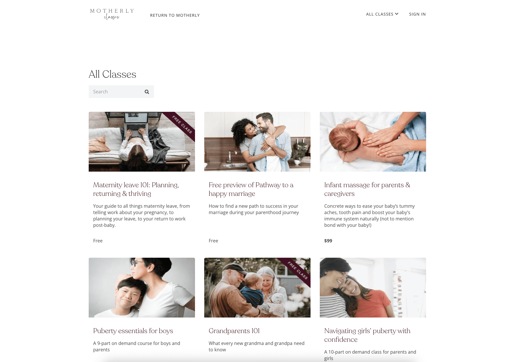
Unique Value Proposition
A large course catalog of on-demand content for moms
and their familiesStrengths
Wealth of expert-driven content
Inclusive on-demand video courses
Clean, soothing interface with a feminine feel
Weaknesses
Amount of content can be overwhelming
Limited courses focused on self-improvement and career

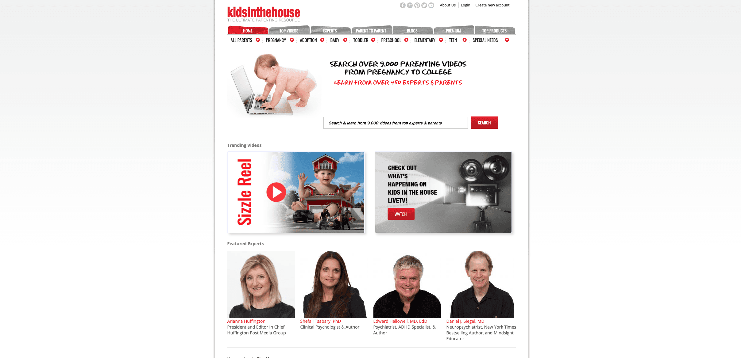
Unique Value Proposition
A large library of written and video content from leading experts on parenting and children’s health.
Strengths
Wealth of content from credentialed childcare experts
Weaknesses
Amount of content can be overwhelming
Dated UI, poor usability
Bulky navigation


Unique Value Proposition
Expert-backed resource center for childhood stage-specific information and support.
Strengths
Many useful fertility and pregnancy tools
Key pregnancy and parenting info organized by stages
Weaknesses
Poor search function
Lots of irrelevant content
02 Synthetic Interviews
02 Synthetic Interviews
Due to time constraints and scheduling conflicts, it was not immediately possible to interview the end users. To begin to uncover larger issues that moms may need help with, I collaborated with the Mom 360 team to create 3 mom personas, and 15 synthetic users via chatgpt. I then used chatgpt to interview the synthetic users as if they were actual moms.
This approach helped gather broad insights, but it had limitations. After a few interviews, the insights were starting to look very similar, focusing on the same 2-3 major points.
03 Expert Interviews
03 Expert Interviews
I conducted interviews with five mom experts that were recruited by Mom 360 to create content for the platform. These experts had extensive experience in the parenting space and coaching for women. Their expertise was invaluable in uncovering insights about our user base, as well as understanding what the experts were looking for in the platform.
I conducted interviews with five mom experts that were recruited by Mom 360 to create content for the platform. These experts had extensive experience in the parenting space and coaching for women. Their expertise was invaluable in uncovering insights about our user base, as well as understanding what the experts were looking for in the platform.
04 User Survey
04 User Survey
Since the synthetic interviews did not provide enough insight into the struggles of the 35,000 moms the Mom 360 team had access to, we conducted a brief user survey.
Since the synthetic interviews did not provide enough insight into the struggles of the 35,000 moms the Mom 360 team had access to, we conducted a brief user survey.
Research Takeaways
Research Takeaways
Moms struggle with anxiety, stress, and overwhelm as they work towards balance.
Moms struggle with anxiety, stress, and overwhelm as they work towards balance.
Moms want actionable and specific advice that accounts for realities of motherhood.
Moms want actionable and specific advice that accounts for realities of motherhood.
Existing resources for moms are generic, inconsistent, and difficult to navigate.
Existing resources for moms are generic, inconsistent, and difficult to navigate.
Promoting accountability through community helps moms feel less alone.
Promoting accountability through community helps moms feel less alone.
Mom experts rely on Mom 360 for marketing of their services.
Mom experts rely on Mom 360 for marketing of their services.
Moms are busy and may only be able to engage with the product in short bursts.
Moms are busy and may only be able to engage with the product in short bursts.
Problem Definition
Problem Definition
To define the problem, I used research takeaways to come up with point of view statements (POV’s) and how might we questions (HMW’s).
To define the problem, I used research takeaways to come up with point of view statements (POV’s) and how might we questions (HMW’s).
POV Statement
POV Statement
We want to help stressed out moms achieve peace because the pressure to be perfect in all areas of their lives is overwhelming.
We want to help stressed out moms achieve peace because the pressure to be perfect in all areas of their lives is overwhelming.
How Might We...
How Might We...
Help moms feel more comfortable and at ease?
Help moms feel more comfortable and at ease?
Teach moms strategies to relieve stress and find joy?
Teach moms strategies to relieve stress and find joy?
Create a resource for moms to turn to when they need self-care?
Create a resource for moms to turn to when they need self-care?
Defining the MVP
Defining the MVP
Due to time constraints, I wasn’t able to design every feature that the web experience would offer. I collaborated with project stakeholders o prioritize key features for the MVP, and proceeded to map out the task flows.
Due to time constraints, I wasn’t able to design every feature that the web experience would offer. I collaborated with project stakeholders o prioritize key features for the MVP, and proceeded to map out the task flows.
Feature Prioritization
Feature Prioritization
I used a value matrix to prioritize features. The P1 features would produce highest impact at the lowest effort, so I chose them as the key features for the MVP.
I used a value matrix to prioritize features. The P1 features would produce highest impact at the lowest effort, so I chose them as the key features for the MVP.
P1: Must Have
P1: Must Have
Account creation
Account creation
AI Personalization assistant
AI Personalization assistant
AI Personalization assistant
Course catalog
Course catalog
Course catalog
Course detail
Course detail
Course detail
Expert bios
Expert bios
Expert bios
One-on-one expert support
One-on-one expert support
One-on-one expert support
Share function
Share function
Share function
Testimonials
Testimonials
Testimonials
P2: Nice to Have
P2: Nice to Have
Community feature
Community feature
Community feature
Content guidelines
Content guidelines
Content guidelines
Gamification
Gamification
Gamification
Learning paths
Learning paths
Learning paths
Notifications and reminders
Notifications and reminders
Notifications and reminders
Offline access
Offline access
Offline access
Progress tracking
Progress tracking
Progress tracking
P3: Will Come Later
P3: Will Come Later
Admin tools
Admin tools
Mobile app
Mobile app
Instructor dashboard
Instructor dashboard
Multi-language support
Multi-language support
Branding and Design
Branding and Design
Branding Guide
Branding Guide
I created a branding guide to maintain a consistent visual aesthetic within the project. I used brand values to inform the color palette and went with a colorful modern design with simple shapes and colors inspired by florals to evoke femininity and ease.
I created a branding guide to maintain a consistent visual aesthetic within the project. I used brand values to inform the color palette and went with a colorful modern design with simple shapes and colors inspired by florals to evoke femininity and ease.
Brand Values
Brand Values
Compassionate
Compassionate
Supportive
Supportive
Trustworthy
Trustworthy
Practical
Practical
Inclusive
Inclusive
Color Palette
Color Palette
Primary
Primary
C7A6C5
C7A6C5
Secondary
Secondary
D0CC3C
D0CC3C
228F85
228F85
Neutrals
Neutrals
ECE6DC
ECE6DC
2C2C06
2C2C06
Logo, Flavicon, and Wordmark
Logo, Flavicon, and Wordmark


Design System
Design System
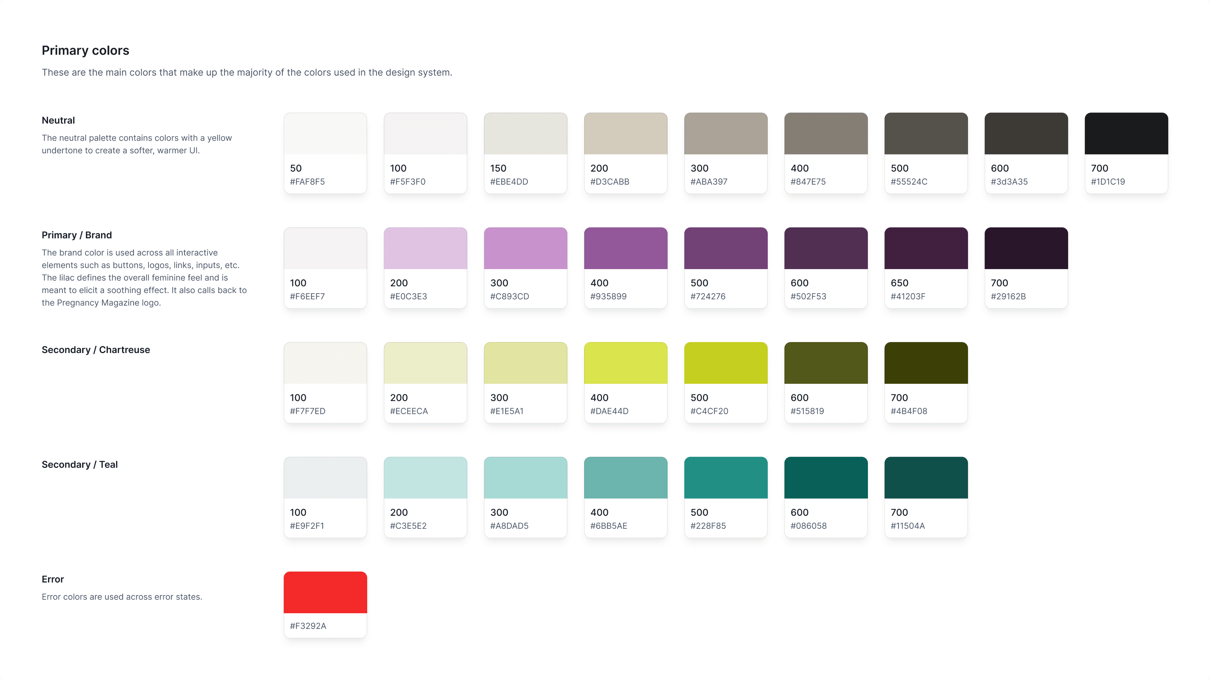
I created a design system with responsive components to streamline the process of creating HiFi wireframes and prototypes. I focused my effort on sustainability and scalability as well as thorough documentation to ensure the development team had everything they needed to maintain the product.
I created a design system with responsive components to streamline the process of creating HiFi wireframes and prototypes. I focused my effort on sustainability and scalability as well as thorough documentation to ensure the development team had everything they needed to maintain the product.


Wireframes
During wireframing, I focused my effort on spotlighting mom experts.
Mom experts are content creators for Mom 360 who bring a wealth of knowledge as well as their customers to the platform. It is essential that they're featured front and center on the app as their brand is key to establishing a loyal user base for Mom 360.


Prototyping and Testing
Prototyping and Testing
Hi-Fi Usability Testing
Hi-Fi Usability Testing
Seven participants completed moderated usability testing in person and via zoom.
Seven participants completed moderated usability testing in person and via zoom.
Overall, test participants had no issues navigating the website or understanding the purpose of buttons, input fields etc.
Participants liked the logo design, color choices, and the overall feel of the website, as well as the chatbot.
Mom 360 stakeholders requested an FAQ section on the homepage and an expandable instructor course bio on the course detail page.
Design Iterations
Design Iterations
Improving Visual Hierarchy
Improving Visual Hierarchy
The problem:
The problem:
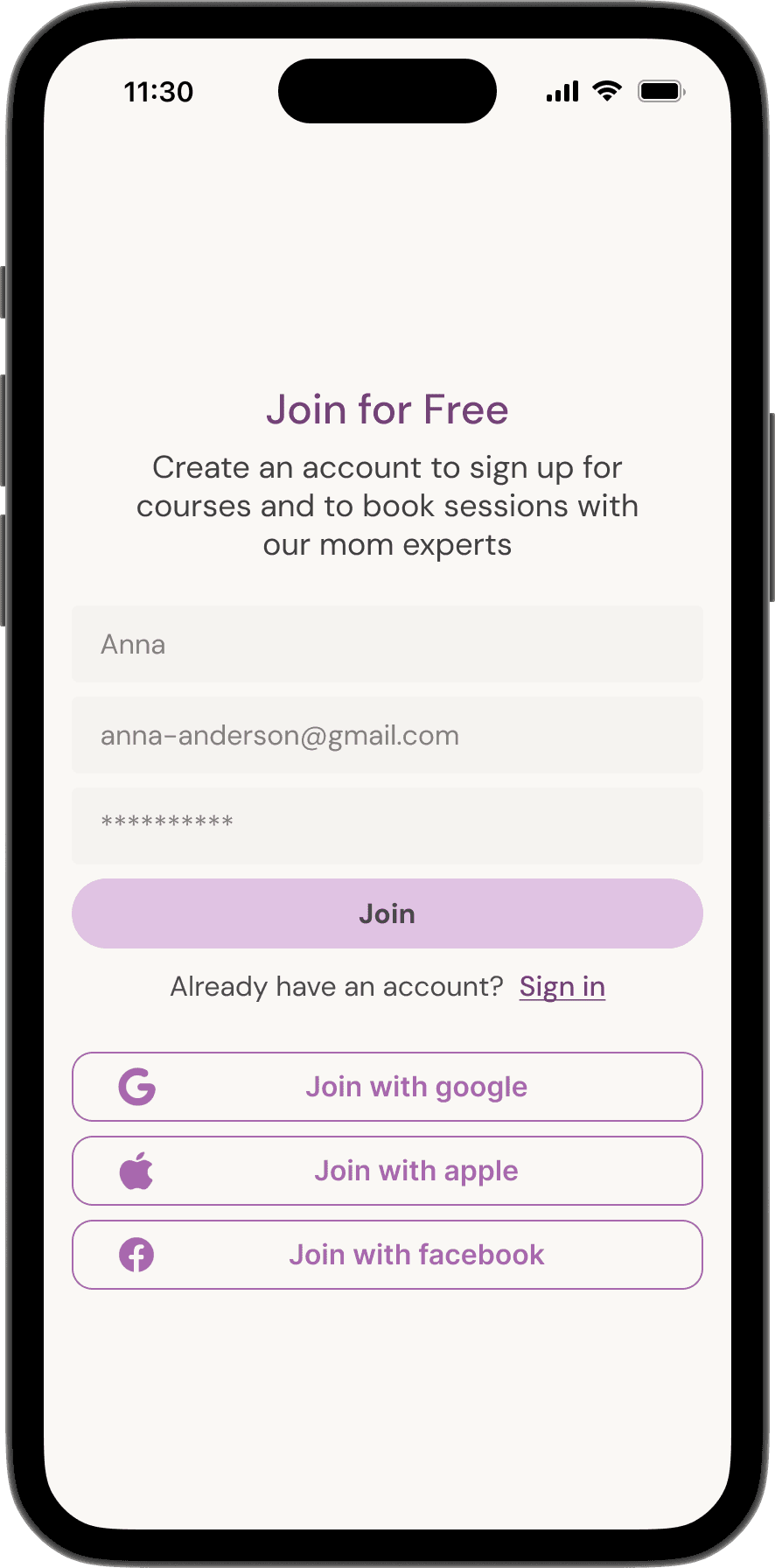
The lack of visual hierarchy on the sign up page made choices feel overwhelming.
The lack of visual hierarchy on the sign up page made choices feel overwhelming.
Before: Confusing hierarchy
Before: Confusing hierarchy
Too much color in buttons - overwhelming
Low contrast in text fields - are they disabled?
Too much color in buttons - overwhelming
Low contrast in text fields - are they disabled?


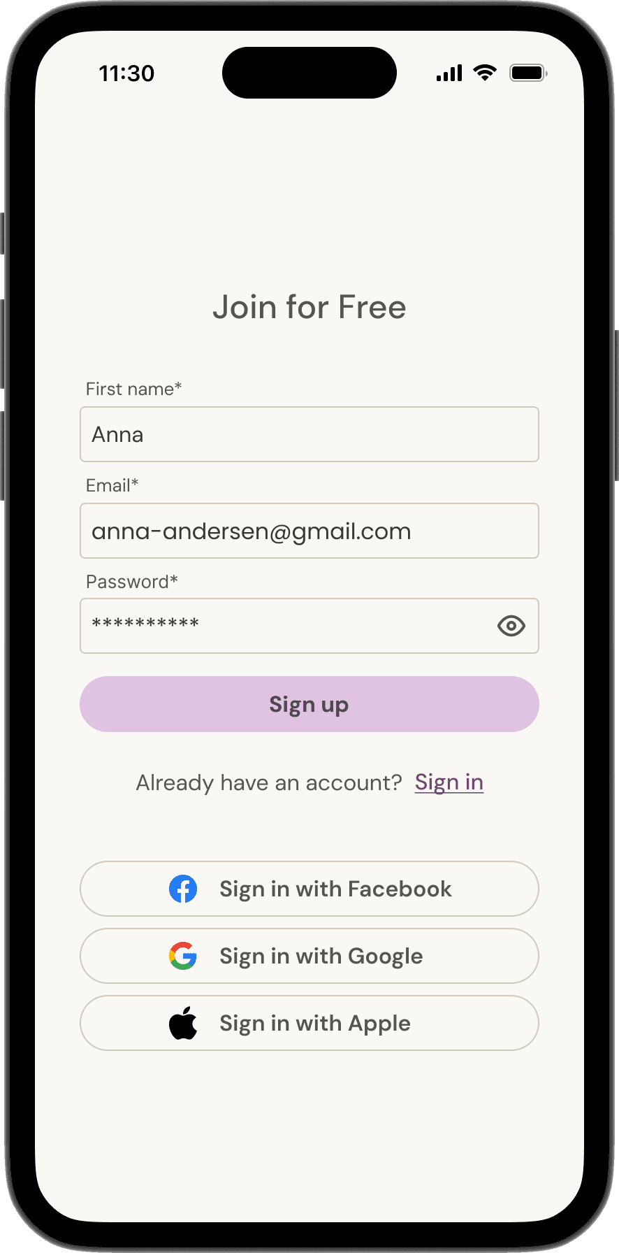
After: Streamlined UI
After: Streamlined UI
Removed color emphasis from social buttons
Increased contrast in text fields so they look editable. Removed extra text to further reduce visual clutter.
Removed color emphasis from social buttons
Increased contrast in text fields so they look editable
Removed extra text to further reduce visual clutter
Removed color emphasis from social buttons
Increased contrast in text fields so they look editable
Removed extra text to further reduce visual clutter


Final Product
Final Product
Navigating the Platform - Mobile
Navigating the Platform - Mobile
I used a carousel at the top of the home page to consolidate the hero section.
This layout allows users to quickly browse courses as soon as they open the website.
Navigating the Platform - Desktop
Navigating the Platform - Desktop
On desktop, I made sure to prominently feature course creators on the course detail page as the platform relies on their reputation to build up a user base.
Personalization Flow
Personalization Flow
Personalization Flow
The stakeholders requested an AI personalization feature to create a competitive edge.
The MVP is a chatbot named Molly that walks users through a short quiz resulting in a course recommendation.
Next Steps
Next Steps
Short Term
Short Term
In the short term, it would be most beneficial to develop a mobile app with short-form content. Mom are busy and have limited ability to engage with a course platform. Therefore, they’d benefit from being able to access the platform on the go and engage with it in short bursts.
In the short term, it would be most beneficial to develop a mobile app with short-form content. Mom are busy and have limited ability to engage with a course platform. Therefore, they’d benefit from being able to access the platform on the go and engage with it in short bursts.
Long Term
Long Term
In the long term, it would be helpful to work with mom experts to develop course tools and create content guidelines to help streamline the content creation process. This will help grow the content selection on the platform.
In the long term, it would be helpful to work with mom experts to develop course tools and create content guidelines to help streamline the content creation process. This will help grow the content selection on the platform.