User Experience Design and Branding
User Experience Design and Branding


Project Overview
WellPet
WellPet
Pet owners often face difficulties in financially planning for their pets' care, and this can lead to stress and anxiety. Traditional budgeting tools don't fully cater to the needs of pet owners due to a lack of transparency in vet care costs.
To help pet owners provide quality care for their pets while managing their finances, WellPet offers a mobile app. It provides budgeting, cost estimation, and care planning tools, making it easier for busy pet owners to ensure their pets receive the care they need without breaking the bank.
Pet owners often face difficulties in financially planning for their pets' care, and this can lead to stress and anxiety. Traditional budgeting tools cannot fully cater to the needs of pet owners due to a lack of transparency in vet care costs.
To help pet owners provide quality care for their pets while managing their finances, WellPet offers a mobile app. It provides budgeting, cost estimation, and care planning tools, making it easier for busy pet owners to ensure their pets receive the care they need without breaking the bank.
View Prototype
The Product
The Product
Mobile app
Mobile app
My Role
My Role
UX research
Branding
UX/UI design
Testing
UX research | Branding | UX/UI design | Testing
Duration
Duration
6 weeks
6 weeks
Discovery and Problem Defintion
Discovery and Problem Defintion
Research Plan
Research Plan
Research Plan
As a pet owner and an avid lover of animals, I wanted to design an app that would cater to the needs of pet owners. Although there were many products on the market that were designed to help with some aspects of pet care (e.g. pet sitting, toy boxes, vet telehealth), I felt there was a gap in comprehensive care planning.
As a pet owner and an avid lover of animals, I wanted to design an app that would cater to the needs of pet owners. Although there were many products on the market that were designed to help with some aspects of pet care (e.g. pet sitting, toy boxes, vet telehealth), I felt there was a gap in comprehensive care planning.
As a pet owner and an avid lover of animals, I decided to design an app that would cater to the needs of pet owners. Although there were many products on the market that were designed to help with some aspects of pet care (e.g. pet sitting, toy boxes, vet telehealth), I felt there was a gap in comprehensive care planning.

Research Hypothesis
Research Hypothesis
Pet owners need a centralized comprehensive solution to help them organize and plan pet care.
Pet owners need a centralized comprehensive solution to help them organize and plan pet care.

Research Goal
Research Goal
Determine the aspects of pet care planning that pet owners find difficult so we can understand what service offerings will be most helpful to them.
Determine the aspects of pet care planning that pet owners find difficult so we can understand what service offerings will be most helpful to them.
Research Methods
Research Methods
Competitor Analysis
Competitor Analysis
User Interviews
User Interviews
Research Implementation
Research Implementation
01 Competitor Analysis
01 Competitor Analysis
I performed a SWOT analysis of three potential competitors. All competitors offered aspects of care planning that pet owners would find useful; however, there were no comprehensive care planning tools that would encompass all aspects of care.
I performed a SWOT analysis of three potential competitors. All competitors offered aspects of care planning that pet owners would find useful; however, there were no comprehensive care planning tools that would encompass all aspects of care.



Target Market
Pet owners looking to purchase products
Pet owners looking for pet care info
Veterinarians, vet clinics, pet owners
Strengths
Established brand
Helpful blog
Online vet help
Product reviews
Free first pet consult
Clean friendly UI
Credible vet-reviewed content
Free non-emergency 24/7 vet help
Vet chat
In-app appointment booking, payment
Healthcare plan feature
Weaknesses
Poor navigation
Poor navigation
No care pricing transparency
Vet care planning only, no other care
02 User Interviews
02 User Interviews
I used affinity mapping to organize the information five interview participants shared with me. It revealed pain points in the budgeting space. Participants also asked for reminder features so they could better manage vet appointments and preventative care.
I used affinity mapping to organize the information five interview participants shared with me. It revealed pain points in the budgeting space. Participants also asked for reminder features so they could better manage vet appointments and preventative care.


Affinity Mapping Top 3 Categories
Research Takeaways
Research Takeaways
Pet owners:
Pet owners:

Want access to low cost emergency vet help when their pets are unwell
Want access to low cost emergency vet help when their pets are unwell

Struggle to budget for vet care as there is little cost transparency
Struggle to budget for vet care as there is little cost transparency

Don’t have a tool for budgeting for recurring pet-related expenses
Don’t have a tool for budgeting for recurring pet-related expenses

Often have no complete preventative routine in place
Often have no complete preventative routine in place

Have difficulty remembering to give preventatives on time
Have difficulty remembering to give preventatives on time

Struggle to find a vet that fits their budget expectations
Struggle to find a vet that fits their budget expectations
Problem Definition
Problem Definition
Due to time constraints it was important to identify the most essential features of the experience. I used tools like POVs and HMWs, prioritization matrix and task flows to zero in on the users’ needs.
Due to time constraints it was important to identify the most essential features of the experience. I used tools like POVs and HMWs, prioritization matrix and task flows to zero in on the users’ needs.
POV Statement
POV Statement
I would like to explore ways to help budget-conscious pet owners build a financial plan for their pets’ care because there is no transparency in vet care costs.
I would like to explore ways to help budget-conscious pet owners build a financial plan for their pets’ care because there is no transparency in vet care costs.
How Might We...
How Might We...
Best serve pet owners who feel stressed and overwhelmed by the lack of cost transparency in vet care?
Best serve pet owners who feel stressed and overwhelmed by the lack of cost transparency in vet care?
Help pet owners eliminate feelings of guilt over lack of financial planning by providing them with budgeting tools?
Help pet owners eliminate feelings of guilt over lack of financial planning by providing them with budgeting tools?
Help pet owners feel confident that they are providing the best care for their pets?
Help pet owners feel confident that they are providing the best care for their pets?
Defining the MVP
Defining the MVP
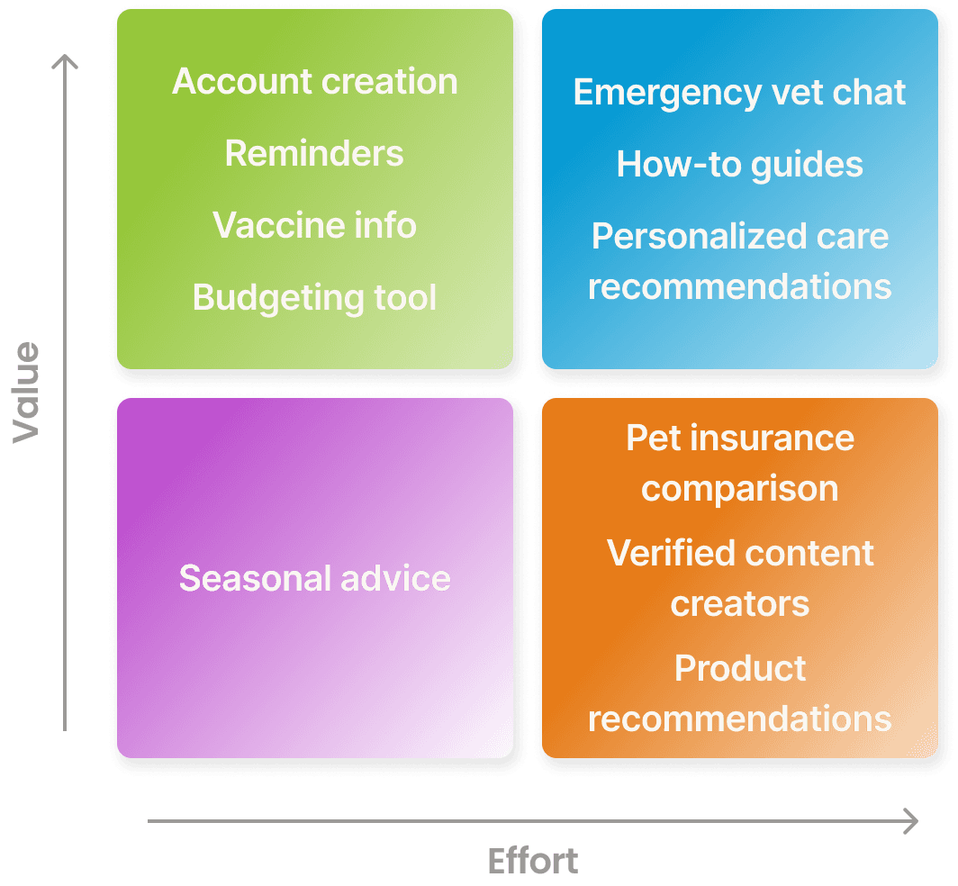
Due to time constraints, I found I would not be able to complete every feature that the web experience would offer. I proceeded to prioritize features to focus on key experiences for the high fidelity wireframes, prototypes, and testing. I used a value matrix to prioritize features, and then proceeded to map out key task flows. I then built a sitemap for the whole website to organize the navigation and envision what the experience would look like as a whole.
Due to time constraints, I found I would not be able to complete every feature that the web experience would offer. I proceeded to prioritize features to focus on key experiences for the high fidelity wireframes, prototypes, and testing. I used a value matrix to prioritize features, and then proceeded to map out key task flows. I then built a sitemap for the whole website to organize the navigation and envision what the experience would look like as a whole.
Feature Prioritization
Feature Prioritization
I listed out potential features and prioritized them using the value matrix. I used the results to inform my decision to move forward with account creation and budgeting experiences. Based on my research, I felt reminders and vaccine info features were lower priority as there were other tools on the market that could help pet owners in those areas.
I listed out potential features and prioritized them using the value matrix. I used the results to inform my decision to move forward with account creation and budgeting experiences. Based on my research, I felt reminders and vaccine info features were lower priority as there were other tools on the market that could help pet owners in those areas.

Design
Design
Design System
Design System
To keep a consistent look and feel throughout the project, I needed a design system. Using a clear design system not only made wireframing smoother but also ensured a uniform and user-friendly experience for the users.
To keep a consistent look and feel throughout the project, I needed a design system. Using a clear design system not only made wireframing smoother but also ensured a uniform and user-friendly experience for the users.
Brand Guide
Brand Values
Brand Values
I started the branding process by brainstorming and defining the brand values to use as a guide for aesthetic decisions.
I started the branding process by brainstorming and defining the brand values to use as a guide for aesthetic decisions.
Honest
Honest
Joyful
Joyful
Inclusive
Inclusive
Sustainable
Sustainable
Color Palette and Typography
Color Palette and Typography
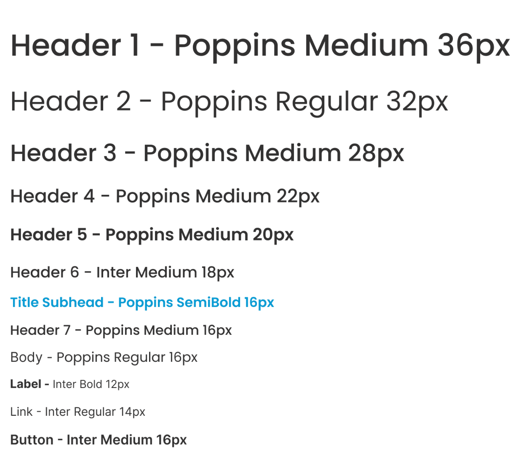
I chose bright blue for the primary color to evoke friendliness and loyalty. I supplemented it with green and purple to keep the palette playful and fun. For the background I chose an off-white paper-like color to compliment the hand-drawn illustrations I had chosen.
For the fonts I chose Poppins and Inter. Both are highly accessible, clean fonts that would not overwhelm the user when combined with the colorful palette.
Primary
Primary
Primary
30BDF4
Secondary
Secondary
Secondary
A7D455
C731D0
Neutral
Neutral
Neutral
434343
9C9A98
FAF7F2


Logo and Flavicons
Logo and Flavicons
I created a pawprint icon for the logo and flavicons using Illustrator.
I created a pawprint icon for the logo and flavicons using Illustrator.
Iconography
Iconography
For iconography, I used Google’s open source Material icons.
I also created custom navigation icons for pet care, budgeting, and home ensuring they matched the Material design aesthetic.
For iconography, I used Google’s open source Material icons.
I also created custom navigation icons for pet care, budgeting, and home ensuring they matched the Material design aesthetic.
Custom Icons
Custom Icons

Pet Care
Budgeting
Home
Material Icons
Material Icons


Component Library
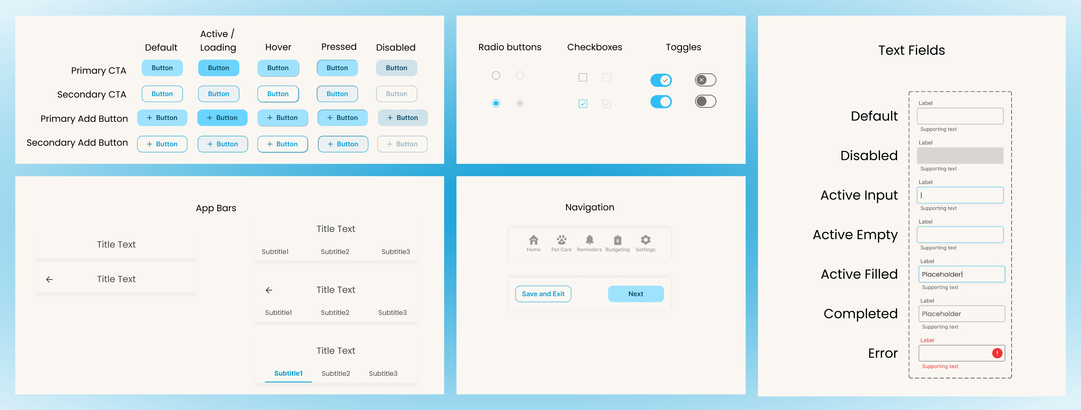
I designed a library of components to streamline the process of creating HiFi wireframes.

Wireframes
Wireframes
I used wireframes to help me create a clear plan for design, making communication easier and providing a foundation for the end product.
I used wireframes to help me create a clear plan for design, making communication easier and providing a foundation for the end product.
Low Fidelity Wireframes
Low Fidelity Wireframes
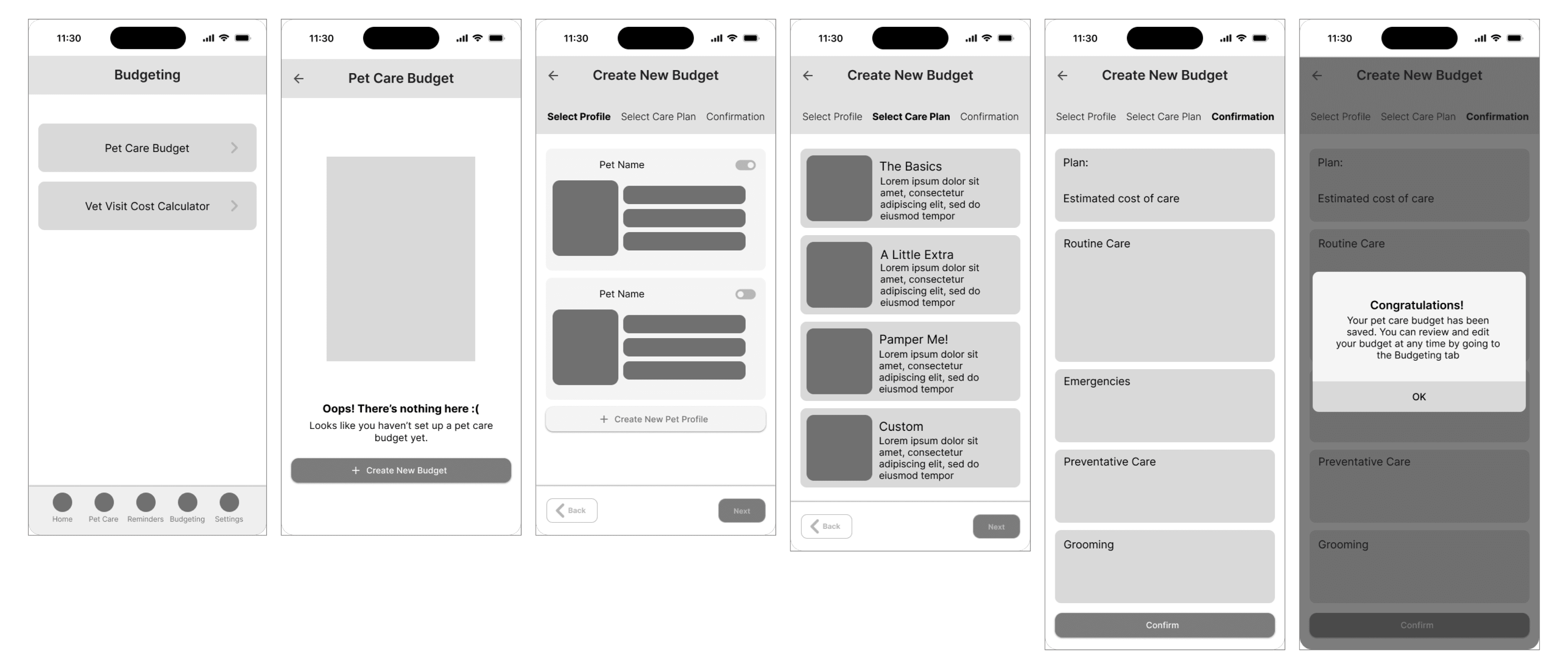
To begin to envision what the web experience would look like, I first sketched the key screens on paper and then digitized them in Figma.
To begin to envision what the web experience would look like, I first sketched the key screens on paper and then digitized them in Figma.


HiFi Wireframes
HiFi Wireframes
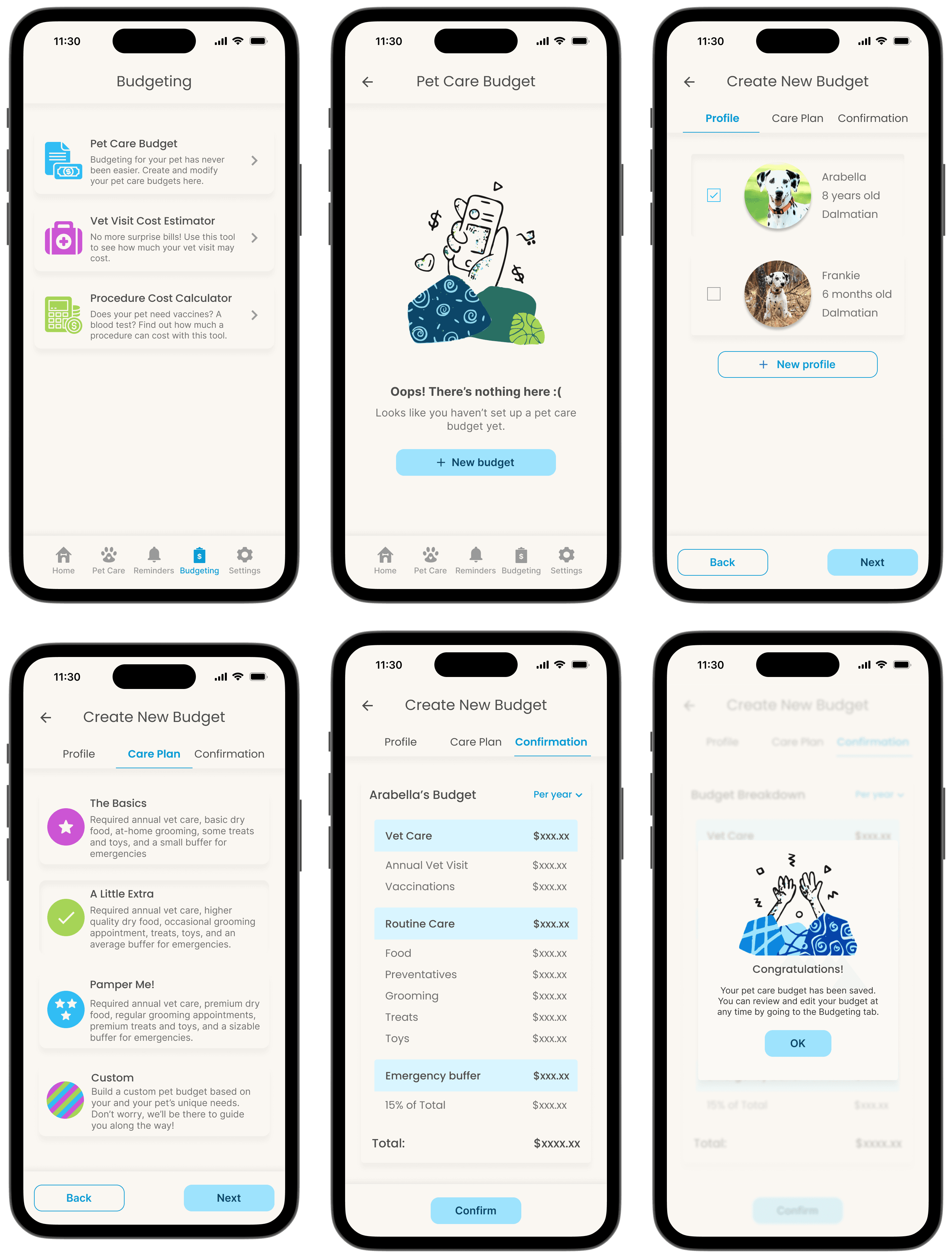
With the design system in place, I brought the low-fi wireframes to high fidelity.
With the design system in place, I brought the low-fi wireframes to high fidelity.


Prototyping and Testing
Prototyping and Testing
Usability Testing
Usability Testing
Five participants completed moderated usability testing using maze.co while I moderated the sessions via Zoom. Though the overall user feedback was positive, the testing showed some improvements could be made to the UI.
Five participants completed moderated usability testing using maze.co while I moderated the sessions via Zoom. Though the overall user feedback was positive, the testing showed some improvements could be made to the UI.
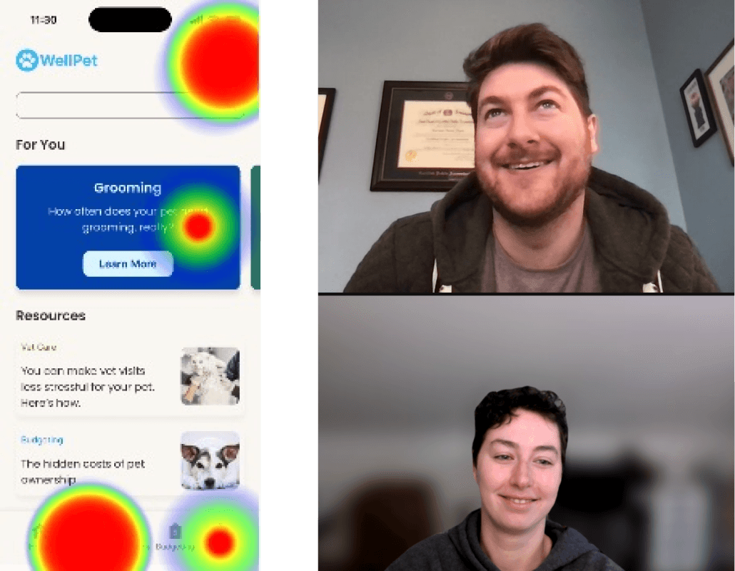


Maze Usability Screenshot | Me Moderating Usability Testing via Zoom
Design Iterations
Design Iterations
01 Error Recognition and Avoidance
01 Error Recognition and Avoidance
The problem:
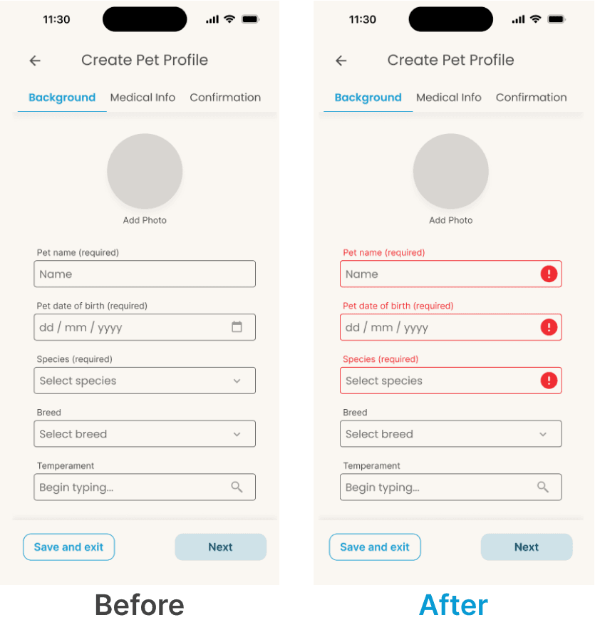
Users were frustrated when they could not click the “Next” button.
The problem:
Users were frustrated when they could not click the “Next” button.
Existing error avoidance features:
The word “required” in the label for fields that are required.
The “Next” button is in disabled state until all required fields are filled.
Existing error avoidance features:
The word “required” in the label for fields that are required.
The “Next” button is in disabled state until all required fields are filled.
The solution:
Add an error state to required fields to pop up when users click “Next” and the required fields are empty.
The solution:
Add an error state to required fields to pop up when users click “Next” and the required fields are empty.

02 Fixed Nav Bar
02 Fixed Nav Bar
The problem:
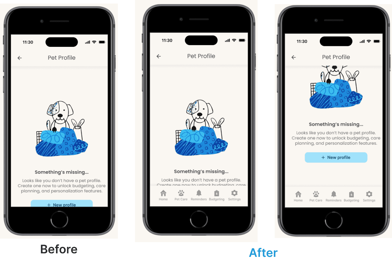
Users with smaller devices were confused when they didn’t see the nav bar or the button bar.
The problem:
Users with smaller devices were confused when they didn’t see the nav bar or the button bar.
The solution:
Fix the bottom Nav and button bars to ensure they’re always visible.
The solution:
Fix the bottom Nav and button bars to ensure they’re always visible.

Final Prototype
Final Prototype
Next Steps
Next Steps
Short Term
Short Term
In the short term, it would be most beneficial to develop reminders, vet telehealth, and personalization experiences. This would further decrease the mental load of the WellPet users.
In the short term, it would be most beneficial to develop reminders, vet telehealth, and personalization experiences. This would further decrease the mental load of the WellPet users.
Long Term
Long Term
In the long term, I would be most interested in tackling the problem of pet owners’ hesitancy about vaccines.
This task would require additional research; however, I believe the gap in pet owners’ understanding of vaccine efficacy is an important one to fill.
In the long term, I would be most interested in tackling the problem of pet owners’ hesitancy about vaccines.
This task would require additional research; however, I believe the gap in pet owners’ understanding of vaccine efficacy is an important one to fill.