Project Overview
Project Overview
Project Overview
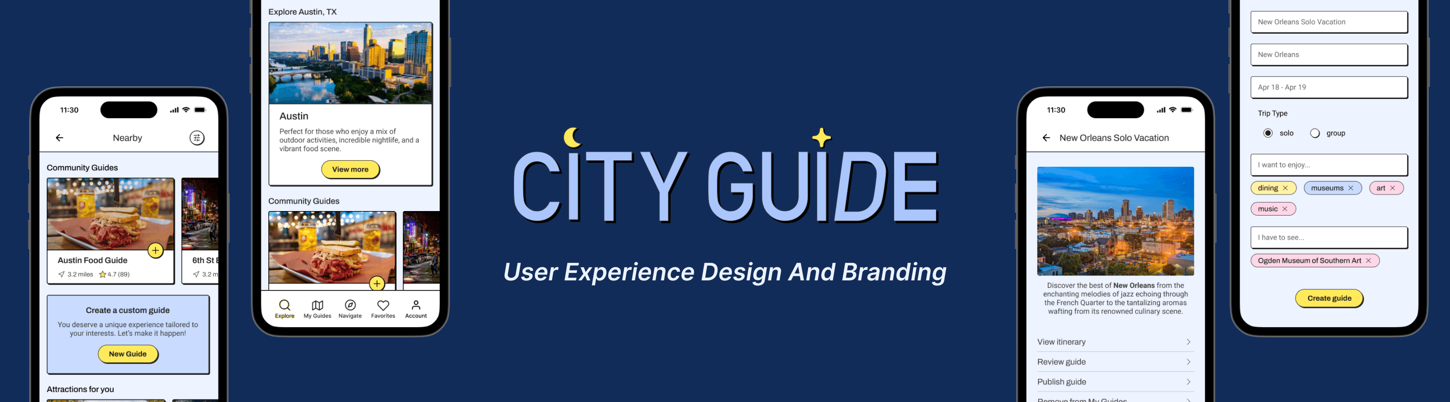
CityGuide
CityGuide
CityGuide
The global travel and tourism market is set to rise substantially in the coming years, significantly contributing to many economies worldwide. Travelers increasingly seek authentic local experiences, prompting platforms like Airbnb to introduce "experiences" with local guides, Google to enhance its Local Guides feature, and AllTrails to offer curated content for US National Parks. Despite numerous digital products providing standard tours and recommendations, there remains a gap for truly unique city experiences. This new product aims to fill that gap by helping users create personalized and customizable city itineraries with ease.
The global travel and tourism market is set to rise substantially in the coming years, significantly contributing to many economies worldwide. Travelers increasingly seek authentic local experiences, prompting platforms like Airbnb to introduce "experiences" with local guides, Google to enhance its Local Guides feature, and AllTrails to offer curated content for US National Parks. Despite numerous digital products providing standard tours and recommendations, there remains a gap for truly unique city experiences. This new product aims to fill that gap by helping users create personalized and customizable city itineraries with ease.
The global travel and tourism market is set to rise substantially in the coming years, significantly contributing to many economies worldwide. Travelers increasingly seek authentic local experiences, prompting platforms like Airbnb to introduce "experiences" with local guides, Google to enhance its Local Guides feature, and AllTrails to offer curated content for US National Parks. Despite numerous digital products providing standard tours and recommendations, there remains a gap for truly unique city experiences. This new product aims to fill that gap by helping users create personalized and customizable city itineraries with ease.
View Prototype
The Product
The Product
The Product
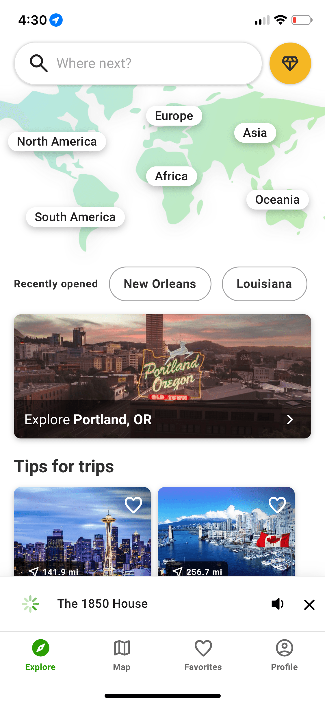
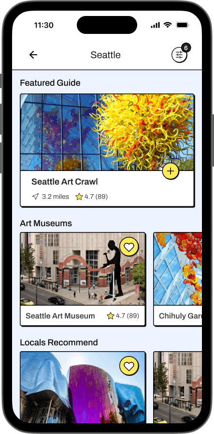
End-to-end mobile application
End-to-end mobile application
End-to-end mobile application
My Role
My Role
UX research
Branding
UX/UI design
Testing
UX research
Branding
UX/UI design
Testing
My Role
UX research
Branding
UX/UI design
Testing
Duration
Duration
Duration
6 weeks
6 weeks
6 weeks
The Process
The Process
The Process

Discovery
Discovery
Discovery

Ideation
Ideation
Ideation

Design
Design
Design

Prototyping
& Testing
Prototyping
& Testing
Prototyping
& Testing

Next Steps
Next Steps
Next Steps

Learnings
Learnings
Learnings
Discovery
Discovery
Discovery
Research Plan
Research Plan
Research Plan
Current travel trends reflect a user preference for authentic local experiences over mainstream tourist attractions. While many digital products offer pre-packaged tours and paid city experiences, I saw an opportunity to create AI-powered uniquely personalized city experiences catered to individual users’ wants.
Current travel trends reflect a user preference for authentic local experiences over mainstream tourist attractions. While many digital products offer pre-packaged tours and paid city experiences, I saw an opportunity to create AI-powered uniquely personalized city experiences catered to individual users’ wants.
Current travel trends reflect a user preference for authentic local experiences over mainstream tourist attractions. While many digital products offer pre-packaged tours and paid city experiences, I saw an opportunity to create AI-powered uniquely personalized city experiences catered to individual users’ wants.

Research Hypothesis
Research Hypothesis
Research Hypothesis
City travelers want unique personalized city travel experiences.
City travelers want unique personalized city travel experiences.
City travelers want unique personalized city travel experiences.

Research Goal
Research Goal
Research Goal
Determine the aspects of planning unique city travel experiences that travelers find difficult so we can understand what features to offer.
Determine the aspects of planning unique city travel experiences that travelers find difficult so we can understand what features to offer.
Determine the aspects of planning unique city travel experiences that travelers find difficult so we can understand what features to offer.
Research Methods
Research Methods
Research Methods
01 Competitor analysis
to study competitor offerings and determine any potential gaps this product can fill.
01 Competitor analysis
to study competitor offerings and determine any potential gaps this product can fill.
01 Competitor analysis
to study competitor offerings and determine any potential gaps this product can fill.
02 User interviews
to understand specific user needs in the city travel space.
02 User interviews
to understand specific user needs in the city travel space.
02 User interviews
to understand specific user needs in the city travel space.
01 Competitor Analysis
01 Competitor Analysis
01 Competitor Analysis
I identified 3 competitors for the competitive analysis - Tripadvisor, AllTrails, and SmartGuide.
I identified 3 competitors for the competitive analysis - Tripadvisor, AllTrails, and SmartGuide.
I identified 3 competitors for the competitive analysis - Tripadvisor, AllTrails, and SmartGuide.
Tripadvisor

Unique Value Proposition
a one-stop platform with expert travel content and reviews of popular attractions
Strengths
robust AI tool for custom personalized travel itineraries
trip-planning resources
guides to common attractions
user reviews
booking services for hotels, restaurants, etc
traveler’s Choice Award highlights top attractions, restaurants, and hotels
ability to purchase experiences
recognized industry leader
Weaknesses
wealth of information can be difficult to navigate
no GPS tracking features
no accessibility features for physically impaired individuals
no safety features
AllTrails

Unique Value Proposition
trail maps for outdoor adventures including hiking, trail running, and biking
Strengths
vast collection of hiking trails across the globe
trail reviews with star ratings, comments, and photos
ability to download maps to use offline
real-time GPS tracking and location sharing
customization and filtering by activity, skill level etc
trail accessibility information
curated National Park Service guides
Weaknesses
limited options for city exploration
no group travel features
city trails limited to well-known tourist attractions and urban parks
SmartGuide
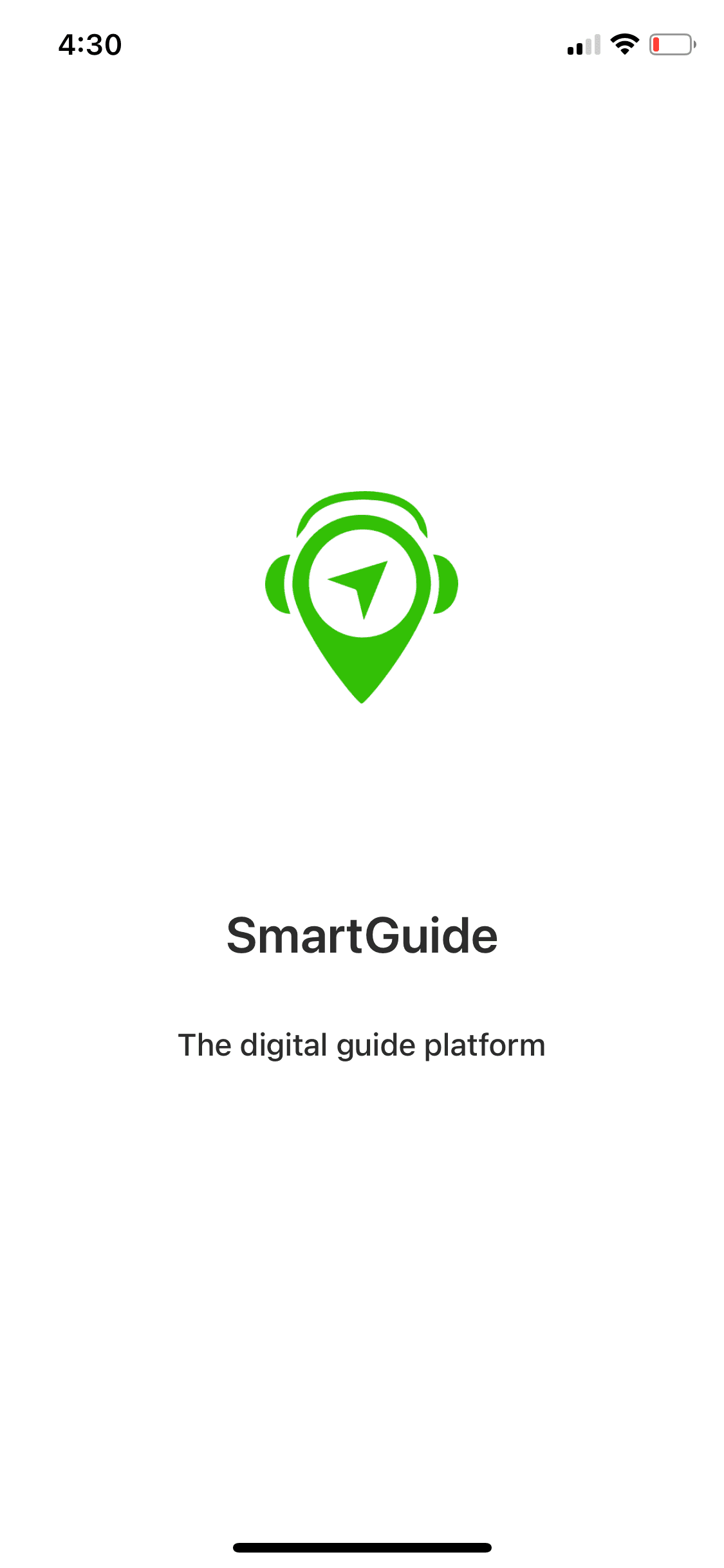
Unique Value Proposition
a digital audio guide app for big cities with content submitted by guides and destinations
Strengths
audio guides for popular city attractions
navigation features for walking tours
ability to purchase experiences
audio guide community reviews
Weaknesses
guides limited to well-known attractions
no group travel features
limited customization options
no accessibility features for hearing- or physically impaired individuals
Tripadvisor
Unique Value Proposition
a one-stop platform with expert travel content and reviews of popular attractions
Strengths
robust AI tool for custom personalized travel itineraries
trip-planning resources
guides to common attractions
user reviews
booking services for hotels, restaurants, etc
traveler’s Choice Award highlights top attractions, restaurants, and hotels
ability to purchase experiences
recognized industry leader
Weaknesses
wealth of information can be difficult to navigate
no GPS tracking features
no accessibility features for physically impaired individuals
no safety features
AllTrails
Unique Value Proposition
trail maps for outdoor adventures including hiking, trail running, and biking
Strengths
vast collection of hiking trails across the globe
trail reviews with star ratings, comments, and photos
ability to download maps to use offline
real-time GPS tracking and location sharing
customization and filtering by activity, skill level etc
trail accessibility information
curated National Park Service guides
Weaknesses
limited options for city exploration
no group travel features
city trails limited to well-known tourist attractions and urban parks
SmartGuide
Unique Value Proposition
a digital audio guide app for big cities with content submitted by guides and destinations
Strengths
audio guides for popular city attractions
navigation features for walking tours
ability to purchase experiences
audio guide community reviews
Weaknesses
guides limited to well-known attractions
no group travel features
limited customization options
no accessibility features for hearing- or physically impaired individuals
Tripadvisor
Unique Value Proposition
a one-stop platform with expert travel content and reviews of popular attractions
Strengths
AI tool for custom personalized travel itineraries
trip-planning resources
guides to common attractions
user reviews
booking services for hotels, restaurants, etc
traveler’s Choice Award for top attractions, restaurants, and hotels
ability to purchase experiences
recognized industry leader
Weaknesses
wealth of information can be difficult to navigate
no GPS tracking features
no accessibility features for physically impaired individuals
no safety features
AllTrails
Unique Value Proposition
trail maps for outdoor adventures including hiking, trail running, and biking
Strengths
vast collection of hiking trails across the globe
trail reviews with star ratings, comments, and photos
ability to download maps to use offline
real-time GPS tracking and location sharing
customization and filtering by activity, skill level etc
trail accessibility information
curated National Park Service guides
Weaknesses
limited options for city exploration
no group travel features
city trails limited to well-known tourist attractions and urban parks
SmartGuide
Unique Value Proposition
a digital audio guide app for big cities with content submitted by guides and destinations
Strengths
audio guides for popular city attractions
navigation features for walking tours
ability to purchase experiences
audio guide community reviews
Weaknesses
guides limited to well-known attractions
no group travel features
limited customization options
no accessibility features for hearing- or physically impaired individuals
02 User Interviews
02 User Interviews
02 User Interviews
I conducted user interviews with 5 participants via Zoom. All participants were US citizens and frequent city travelers to cities in the US and abroad.
I conducted user interviews with 5 participants via Zoom. All participants were US citizens and frequent city travelers to cities in the US and abroad.
I conducted user interviews with 5 participants via Zoom. All participants were US citizens and frequent city travelers to cities in the US and abroad.
Affinity Mapping
Affinity Mapping
Affinity Mapping
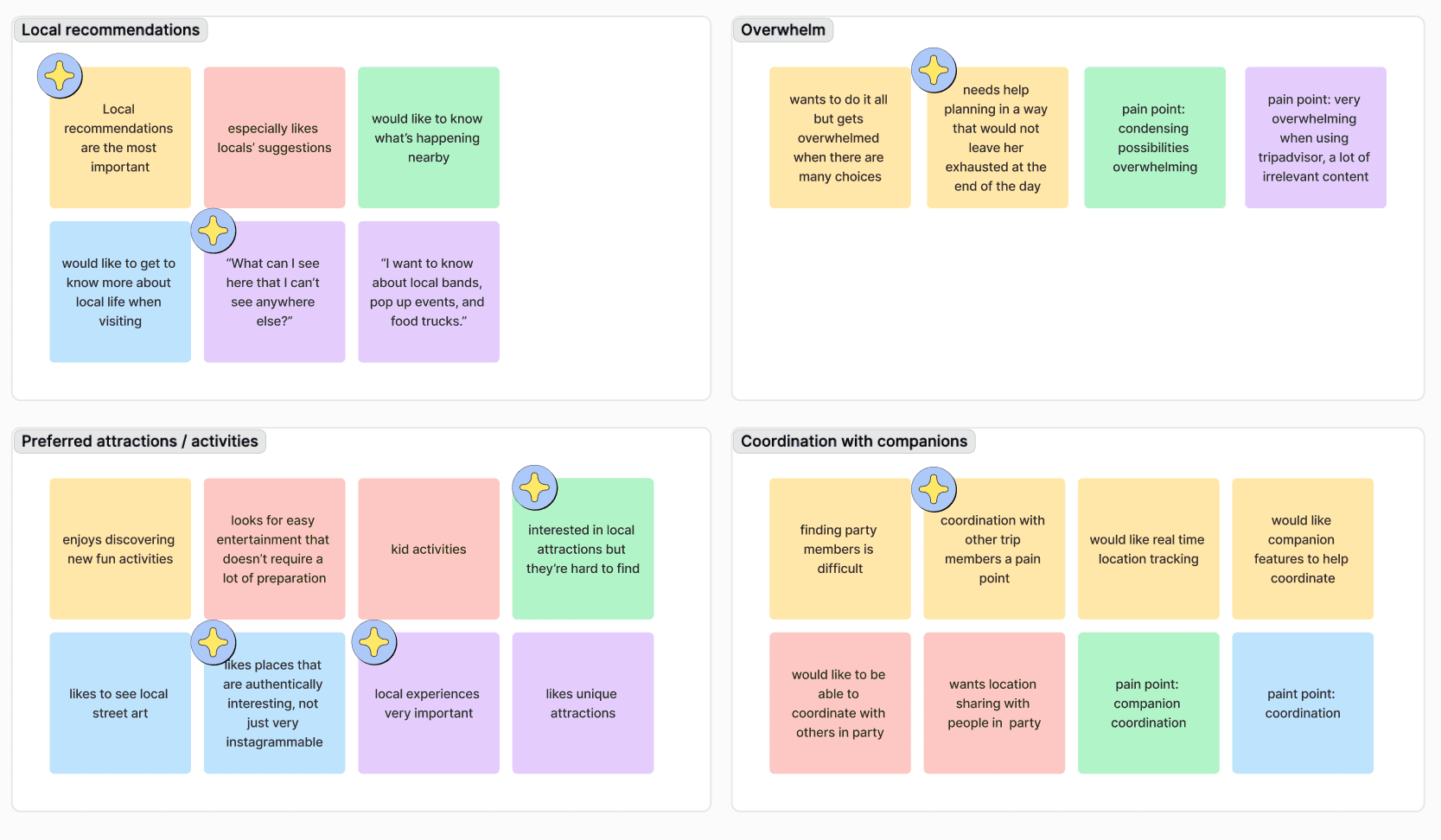
I used affinity mapping to organize the information interview participants shared with me. The pain points surrounded issues of finding experiences relevant to the individual’s needs. Group travelers also asked for features to help find each other on trips.
I used affinity mapping to organize the information interview participants shared with me. The pain points surrounded issues of finding experiences relevant to the individual’s needs. Group travelers also asked for features to help find each other on trips.
I used affinity mapping to organize the information interview participants shared with me. The pain points surrounded issues of finding experiences relevant to the individual’s needs. Group travelers also asked for features to help find each other on trips.
Research Takeaways
Research Takeaways
Research Takeaways
City travelers:
City travelers:
City travelers:
find travel planning overwhelming
find travel planning overwhelming
find travel planning overwhelming
want to enjoy local experiences, but don’t have the resources to find them
want to enjoy local experiences, but don’t have the resources to find them
want to enjoy local experiences, but don’t have the resources to find them
say personalization features are important to find attractions relevant to them
say personalization features are important to find attractions relevant to them
say personalization features are important to find attractions relevant to them
want help finding their travel companions in real time
want help finding their travel companions in real time
want help finding their travel companions in real time
want real-time navigation assistance
want real-time navigation assistance
want real-time navigation assistance
female travelers identified safety as an important aspect of city travel
female travelers identified safety as an important aspect of city travel
female travelers identified safety as an important aspect of city travel
User Personas
User Personas
I created two personas to represent my users’ challenges in the space of city travel. These personas helped me empathize with users and stay connected to their wants and needs throughout the project.
I created two personas to represent my users’ challenges in the space of city travel. These personas helped me empathize with users and stay connected to their wants and needs throughout the project.

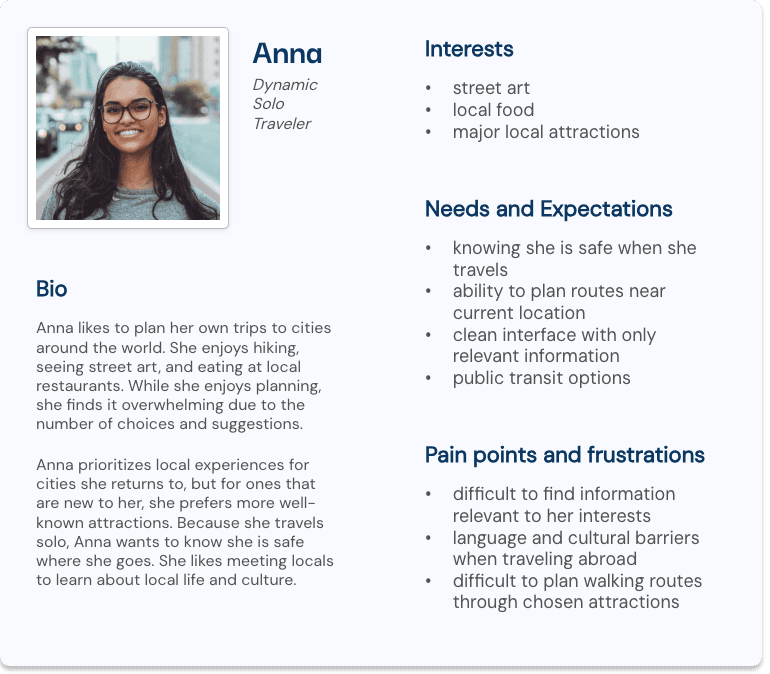
Anna
Dynamic Solo Traveler
Dynamic Solo Traveler
30
Project Manager
Philadelphia, PA
Bio
Anna likes to plan her own trips to cities around the world. She enjoys hiking, seeing street art, and eating at local restaurants. While she enjoys planning, she finds it overwhelming due to the number of choices and suggestions.
Anna prioritizes local experiences for cities she returns to, but for ones that are new to her, she prefers more well-known attractions. Because she travels solo, Anna wants to know she is safe where she goes. She likes meeting locals to learn about local life and culture.
Interests
street art
local food
major local attractions
Needs and Expectations
knowing she is safe when she travels
ability to plan routes near current location
clean interface with only relevant information
public transit options
Pain points and frustrations
difficult to find information relevant to her interests
language and cultural barriers when traveling abroad
difficult to plan walking routes through chosen attractions
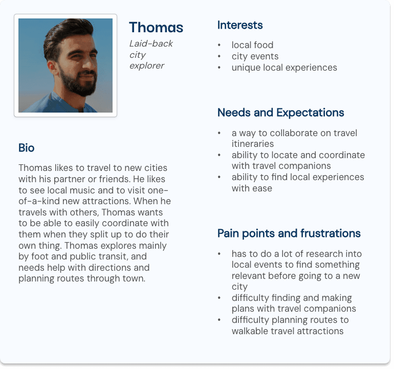
Thomas
Laid-back city explorer
35
IT specialist
Houston, TX
Bio
Thomas likes to travel to new cities with his partner or friends. He likes to see local music and to visit one-of-a-kind new attractions. When he travels with others, Thomas wants to be able to easily coordinate with them when they split up to do their own thing. Thomas explores mainly by foot and public transit, and needs help with directions and planning routes through town.
Interests
local food
city events
unique local experiences
Needs and Expectations
a way to collaborate on travel itineraries
ability to locate and coordinate with travel companions
ability to find local experiences with ease
Pain points and frustrations
has to do a lot of research into local events to find something relevant before going to a new city
difficulty finding and making plans with travel companions
difficulty planning routes to walkable travel attractions
Ideation
Ideation
Ideation
Problem Definition
Problem Definition
Problem Definition
Due to time constraints it was important to identify the most essential features of the web experience. I used tools like POVs and HMWs, prioritization matrix and task flows to zero in on the users’ needs.
Due to time constraints it was important to identify the most essential features of the web experience. I used tools like POVs and HMWs, prioritization matrix and task flows to zero in on the users’ needs.
Due to time constraints it was important to identify the most essential features of the web experience. I used tools like POVs and HMWs, prioritization matrix and task flows to zero in on the users’ needs.
POV & HMW’s
POV & HMW’s
POV & HMW’s
Point of view (POV) statements and How Might We? (HMW) questions helped me identify my users’ most important needs so I could begin to address them directly.
Point of view (POV) statements and How Might We? (HMW) questions helped me identify my users’ most important needs so I could begin to address them directly.
Point of view (POV) statements and How Might We? (HMW) questions helped me identify my users’ most important needs so I could begin to address them directly.
POV Statement
POV Statement
POV Statement
I want to help overwhelmed travelers visit local attractions when they travel to cities because reliable information about local sights can be difficult to find.
I want to help overwhelmed travelers visit local attractions when they travel to cities because reliable information about local sights can be difficult to find.
I want to help overwhelmed travelers visit local attractions when they travel to cities because reliable information about local sights can be difficult to find.
How Might We...
How Might We...
How Might We...
Help travelers feel more comfortable when exploring city attractions
Help travelers feel more comfortable when exploring city attractions
Create a reliable source of information about local attractions
Create a reliable source of information about local attractions
Craft a personalized experience for city travelers
Craft a personalized experience for city travelers
Defining the MVP
Defining the MVP
Defining the MVP
Due to time constraints, I wasn’t able to design every feature that the web experience would offer. I proceeded to prioritize features to focus on key experiences for the high fidelity wireframes, prototypes, and testing. I used a value matrix to prioritize features, and then proceeded to map out key user flows. I then built a sitemap for the whole website to organize the navigation and envision what the experience would look like as a whole.
Due to time constraints, I wasn’t able to design every feature that the web experience would offer. I proceeded to prioritize features to focus on key experiences for the high fidelity wireframes, prototypes, and testing. I used a value matrix to prioritize features, and then proceeded to map out key user flows. I then built a sitemap for the whole website to organize the navigation and envision what the experience would look like as a whole.
Due to time constraints, I wasn’t able to design every feature that the web experience would offer. I proceeded to prioritize features to focus on key experiences for the high fidelity wireframes, prototypes, and testing. I used a value matrix to prioritize features, and then proceeded to map out key user flows. I then built a sitemap for the whole website to organize the navigation and envision what the experience would look like as a whole.
Due to time constraints, I wasn’t able to design every feature that the web experience would offer. I proceeded to prioritize features to focus on key experiences for the high fidelity wireframes, prototypes, and testing. I used a value matrix to prioritize features, and then proceeded to map out key user flows. I then built a sitemap for the whole website to organize the navigation and envision what the experience would look like as a whole.
Feature Prioritization
Feature Prioritization
Feature Prioritization
I used a value matrix to prioritize features. Personalized guides, navigation, and local discovery were the P1 features I decided to focus on for the design and prototyping phases. To ensure the project fit within the timeline I decided to reserve features for international travelers for later.
I used a value matrix to prioritize features. Personalized guides, navigation, and local discovery were the P1 features I decided to focus on for the design and prototyping phases. To ensure the project fit within the timeline I decided to reserve features for international travelers for later.
I used a value matrix to prioritize features. Personalized guides, navigation, and local discovery were the P1 features I decided to focus on for the design and prototyping phases. To ensure the project fit within the timeline I decided to reserve features for international travelers for later.
P1: Must Have
P1: Must Have
P1: Must Have
Itinerary generator
Itinerary generator
Itinerary generator
Global search
Global search
Global search
Personalized recommendations
Personalized recommendations
Personalized recommendations
Local discovery
Local discovery
Local discovery
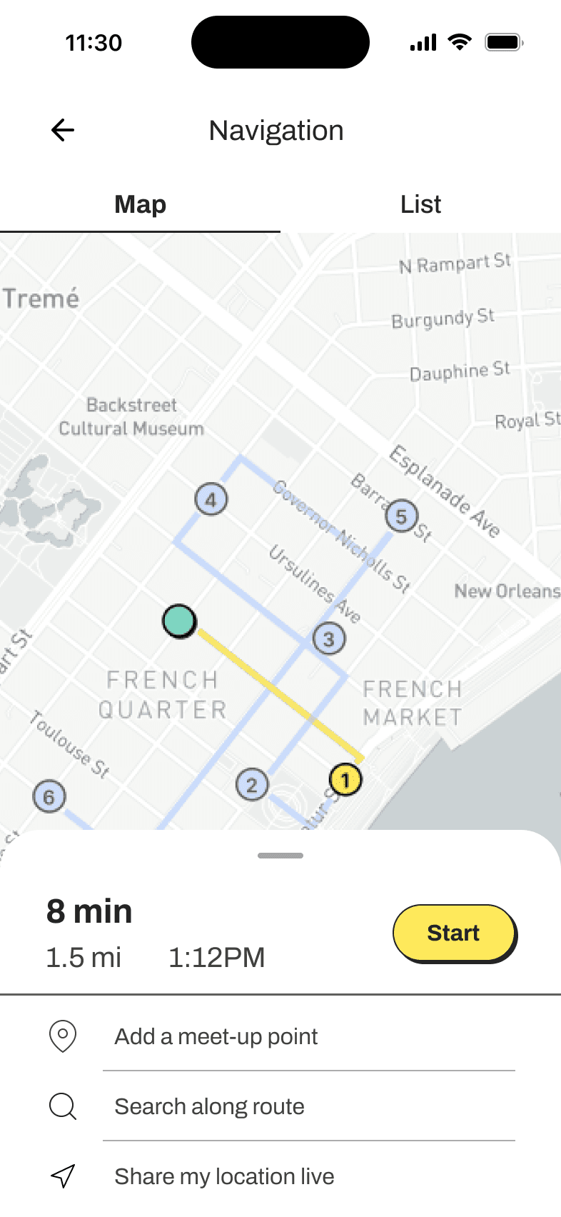
Navigation assistance
Navigation assistance
Navigation assistance
P2: Nice to Have
P2: Nice to Have
P2: Nice to Have
Neighborhood guides
Neighborhood guides
Neighborhood guides
Local events
Local events
Local events
P3: Can Come Later
P3: Can Come Later
P3: Can Come Later
Google reviews integration
Google reviews integration
Google reviews integration
Features for international travelers
Features for international travelers
Features for international travelers
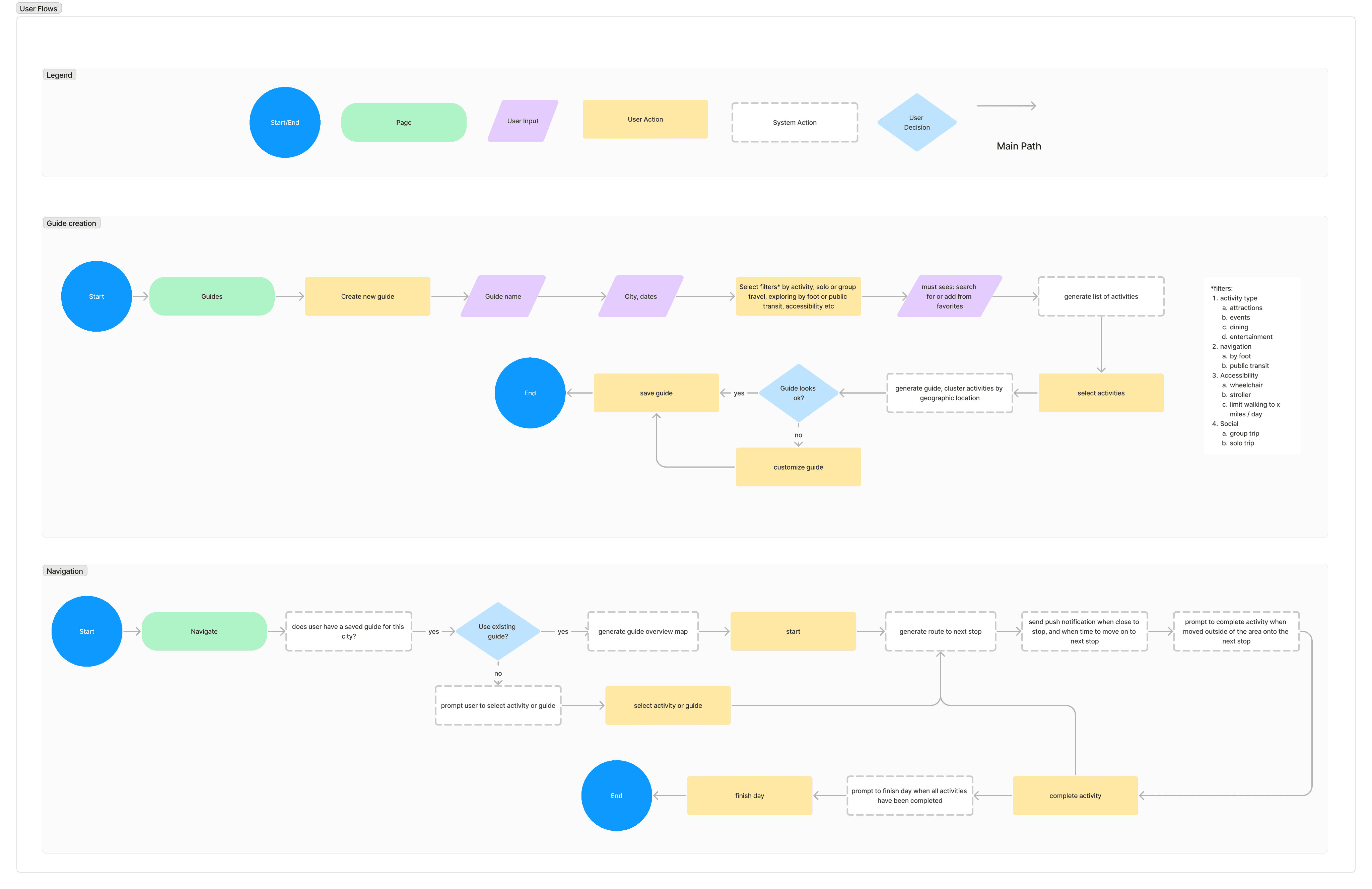
User Flows
User Flows
User Flows
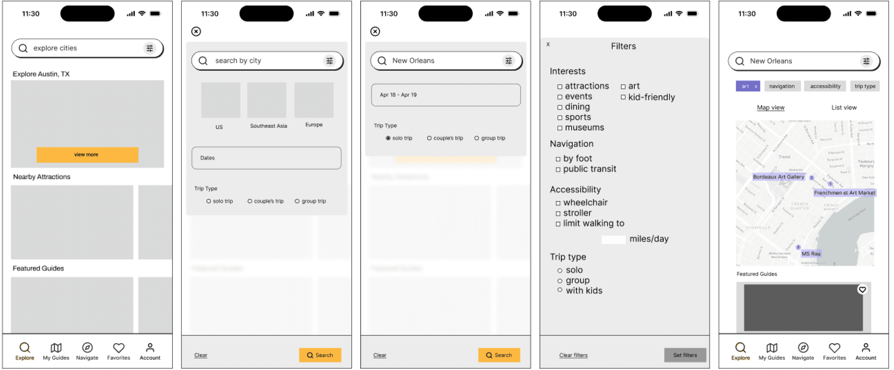
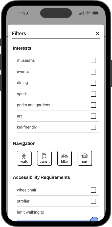
I put together two user flows to begin to envision what navigation and guide creation experiences would look like. The guide creation experience would include robust filtering features to ensure the users get the level of personalization they are looking for.
I put together two user flows to begin to envision what navigation and guide creation experiences would look like. The guide creation experience would include robust filtering features to ensure the users get the level of personalization they are looking for.
I put together two user flows to begin to envision what navigation and guide creation experiences would look like. The guide creation experience would include robust filtering features to ensure the users get the level of personalization they are looking for.
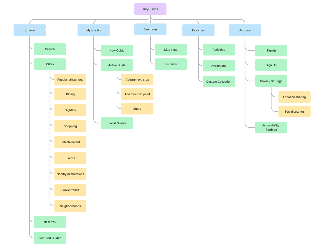
Information Architecture
Information Architecture
Information Architecture
I created the below sitemap to organize features on the website into five navigation categories - explore (home), my guides, navigation, favorites to save favorite attractions, and settings.
I created the below sitemap to organize features on the website into five navigation categories - explore (home), my guides, navigation, favorites to save favorite attractions, and settings.
I created the below sitemap to organize features on the website into five navigation categories - explore (home), my guides, navigation, favorites to save favorite attractions, and settings.
Design
Design
Design
Design System
Design System
Design System
I created a design system to maintain a consistent appearance within the project. I used brand values to inform the color palette and went with a modern neubrutalist design for the cards and buttons to maintain an entertaining and uplifting flair.
I created a design system to maintain a consistent appearance within the project. I used brand values to inform the color palette and went with a modern neubrutalist design for the cards and buttons to maintain an entertaining and uplifting flair.
I created a design system to maintain a consistent appearance within the project. I used brand values to inform the color palette and went with a modern neubrutalist design for the cards and buttons to maintain an entertaining and uplifting flair.
Brand Guide
Brand Guide
Brand Guide
Brand Values
Brand Values
Brand Values
I started the branding process by first brainstorming and defining the brand values to use as a guide for aesthetic decisions.
I started the branding process by first brainstorming and defining the brand values to use as a guide for aesthetic decisions.
I started the branding process by first brainstorming and defining the brand values to use as a guide for aesthetic decisions.
Fun
Fun
Fun
Easy
Easy
Easy
Safe
Safe
Safe
Reliable
Reliable
Reliable
Logo
Logo
Logo
I iterated on the logo several times. I began by sketching landscapes of cities at night to evoke vibrant nightlife that travelers can experience when going to new cities. The logo then evolved into a yellow crescent moon on a light blue background.
I iterated on the logo several times. I began by sketching landscapes of cities at night to evoke vibrant nightlife that travelers can experience when going to new cities. The logo then evolved into a yellow crescent moon on a light blue background.
I iterated on the logo several times. I began by sketching landscapes of cities at night to evoke vibrant nightlife that travelers can experience when going to new cities. The logo then evolved into a yellow crescent moon on a light blue background.
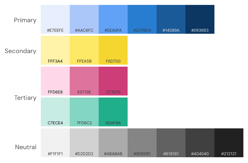
Color Palette
Color Palette
Color Palette
The color palette was inspired by illustrations in the Abstract pack by Icons8. These illustrations were edited and used in other areas of this project.
I chose yellow for emphasis and CTA’s and light blue for backgrounds.
The color palette was inspired by illustrations in the Abstract pack by Icons8. These illustrations were edited and used in other areas of this project.
I chose yellow for emphasis and CTA’s and light blue for backgrounds.
The color palette was inspired by illustrations in the Abstract pack by Icons8. These illustrations were edited and used in other areas of this project.
I chose yellow for emphasis and CTA’s and light blue for backgrounds.
#f1f1f1
#d2d2d2
#ababab
#858585
#616161
#404040
#212121
FFEA5B
E0719E
7FD6C2
FFF3A4
FFD6E8
C7ECE4
#093663
#14589a
#207bd4
#5ea0fa
#AAC6FC
#e7eefe
F6D700
CF3976
0DAF8A
Secondary
Tertiary
Neutral
Primary
Typography
Typography
Typography
For the fonts I chose Archivo and Roboto as I felt they worked well with the style I had chosen.
For the fonts I chose Archivo and Roboto as I felt they worked well with the style I had chosen.
For the fonts I chose Archivo and Roboto as I felt they worked well with the style I had chosen.
Header 1 - Archivo Medium 20px
Header 2 - Archivo Regular 20px
Header 3 - Archivo SemiBold 18px
Header 4 - Archivo Medium 18px
Header 5 - Archivo Regular 18px
Body - Roboto Regular 16px
Label - Roboto 12px
Link - Roboto 14px
Button - Archivo SemiBold 16px
Iconography
Iconography
Iconography
For iconography, I used a combination of Feather icons and free icons from the noun project.
For iconography, I used a combination of Feather icons and free icons from the noun project.
For iconography, I used a combination of Feather icons and free icons from the noun project.


Component Library
Component Library
Component Library
I designed a library of components to create a coherent aesthetic and streamline the process of creating HiFi wireframes and prototypes.
I designed a library of components to create a coherent aesthetic and streamline the process of creating HiFi wireframes and prototypes.
I designed a library of components to create a coherent aesthetic and streamline the process of creating HiFi wireframes and prototypes.
Buttons
Buttons
Button
Button
Button
Button
Button
Button
Button
Button
Button
Button
Primary
Active
Pressed
Disabled
Secondary
Primary add
Secondary add
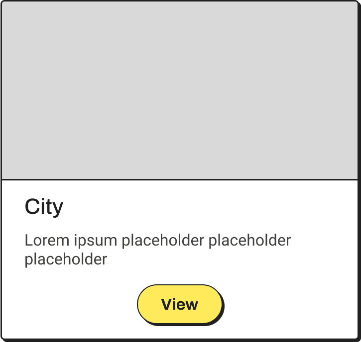
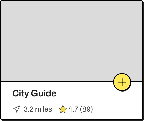
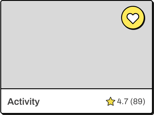
Cards
Cards
Filter Chips
Filter Chips
Label
Label
Label
Label
Label
Label
Label
Label
Label
Label
Label
Label
Inputs
Inputs
Activated
Focused
Error
Nav Bar
Nav Bar
Explore
My Guides
Navigate
Favorites
Account
Search Bar
Search Bar
explore destinations
Checkboxes, Toggles
Checkboxes
Toggles
Wireframes
Wireframes
Wireframes
I used wireframes to help me create a clear plan for design, making communication easier and providing a foundation for the end product.
I used wireframes to help me create a clear plan for design, making communication easier and providing a foundation for the end product.
I used wireframes to help me create a clear plan for design, making communication easier and providing a foundation for the end product.
Low- and Mid-Fidelity Wireframes
Low- and Mid-Fidelity Wireframes
Low- and Mid-Fidelity Wireframes
To begin to envision what the web experience would look like, I sketched the key screens on paper and digitized them in Figma.
To begin to envision what the web experience would look like, I sketched the key screens on paper and digitized them in Figma.
To begin to envision what the web experience would look like, I sketched the key screens on paper and digitized them in Figma.
HiFi Wireframes
HiFi Wireframes
HiFi Wireframes
I performed usability testing with the mid-fi wireframes and made changes according to user feedback. With the design system in place, I implemented the improvements and brought the designs to high fidelity.
I performed usability testing with the mid-fi wireframes and made changes according to user feedback. With the design system in place, I implemented the improvements and brought the designs to high fidelity.
I performed usability testing with the mid-fi wireframes and made changes according to user feedback. With the design system in place, I implemented the improvements and brought the designs to high fidelity.
I performed usability testing with the mid-fi wireframes and made changes according to user feedback. With the design system in place, I implemented the improvements and brought the designs to high fidelity.
Prototyping and Testing
Prototyping and Testing
Prototyping and Testing
Mid-Fi Prototype and Testing
Mid-Fi Prototype and Testing
Mid-Fi Prototype and Testing
I first created a mid-fidelity prototype to test usability and gather feedback on the UI from my mentor and peers.
I first created a mid-fidelity prototype to test usability and gather feedback on the UI from my mentor and peers.
I first created a mid-fidelity prototype to test usability and gather feedback on the UI from my mentor and peers.
Seven participants completed unmoderated mid-fi usability testing using maze.co. The overall user feedback was positive, but the testing showed some small improvements could be made to the UI.
Seven participants completed unmoderated mid-fi usability testing using maze.co. The overall user feedback was positive, but the testing showed some small improvements could be made to the UI.
Seven participants completed unmoderated mid-fi usability testing using maze.co. The overall user feedback was positive, but the testing showed some small improvements could be made to the UI.
Seven participants completed unmoderated mid-fi usability testing using maze.co. The overall user feedback was positive, but the testing showed some small improvements could be made to the UI.
I made minor content and UI changes per user feedback and proceeded to bring the wireframes to high fidelity
I made minor content and UI changes per user feedback and proceeded to bring the wireframes to high fidelity
I made minor content and UI changes per user feedback and proceeded to bring the wireframes to high fidelity
High-Fi Prototype
High-Fi Prototype
High-Fi Prototype
I created a high fidelity prototype to test usability and gather feedback from my mentor and peers.
I created a high fidelity prototype to test usability and gather feedback from my mentor and peers.
I created a high fidelity prototype to test usability and gather feedback from my mentor and peers.
Usability Testing
Usability Testing
Usability Testing
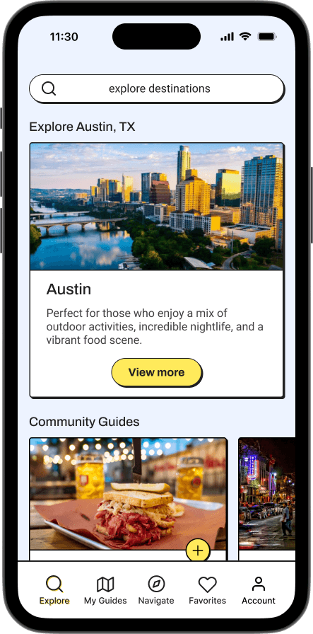
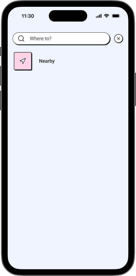
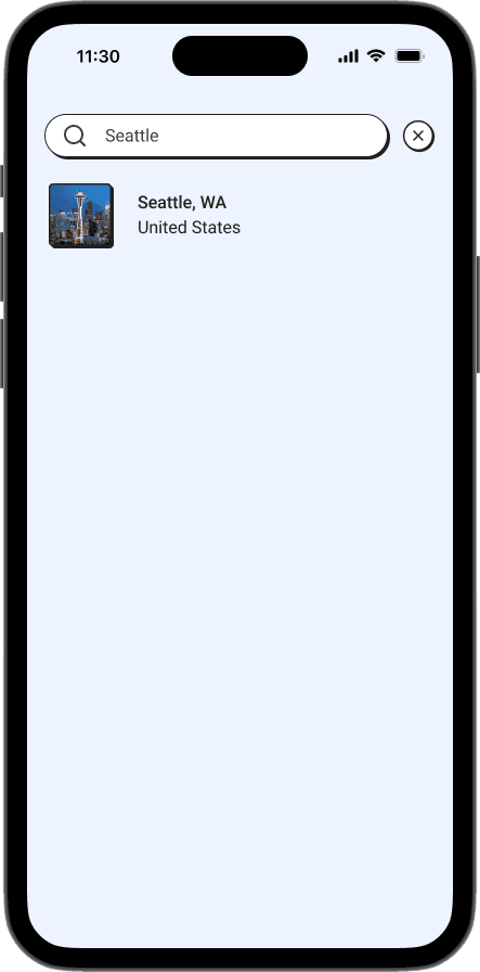
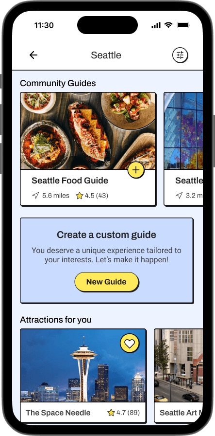
Seven participants completed unmoderated usability testing using maze.co.
Users were tested on 3 flows. They were asked to:
Search for a destination.
Narrow down search results based on provided criteria.
Add a meet-up point to meet with a travel companion.
Seven participants completed unmoderated usability testing using maze.co.
Users were tested on 3 flows. They were asked to:
Search for a destination.
Narrow down search results based on provided criteria.
Add a meet-up point to meet with a travel companion.
Seven participants completed unmoderated usability testing using maze.co.
Users were tested on 3 flows. They were asked to:
Search for a destination.
Narrow down search results based on provided criteria.
Add a meet-up point to meet with a travel companion.
Seven participants completed unmoderated usability testing using maze.co.
Users were tested on 3 flows. They were asked to:
Search for a destination.
Narrow down search results based on provided criteria.
Add a meet-up point to meet with a travel companion.
Overall, the participants liked the UI and the aesthetics, but wished for an easier way to find the “add a meet-up point” option.
Overall, the participants liked the UI and the aesthetics, but wished for an easier way to find the “add a meet-up point” option.
Overall, the participants liked the UI and the aesthetics, but wished for an easier way to find the “add a meet-up point” option.
Design Iterations
Design Iterations
Design Iterations
Improving Recognition
Improving Recognition
Improving Recognition
The problem:
The problem:
The problem:
The problem:
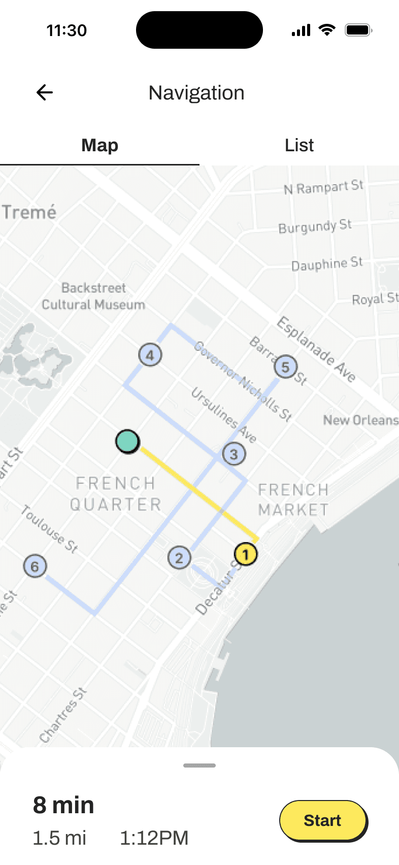
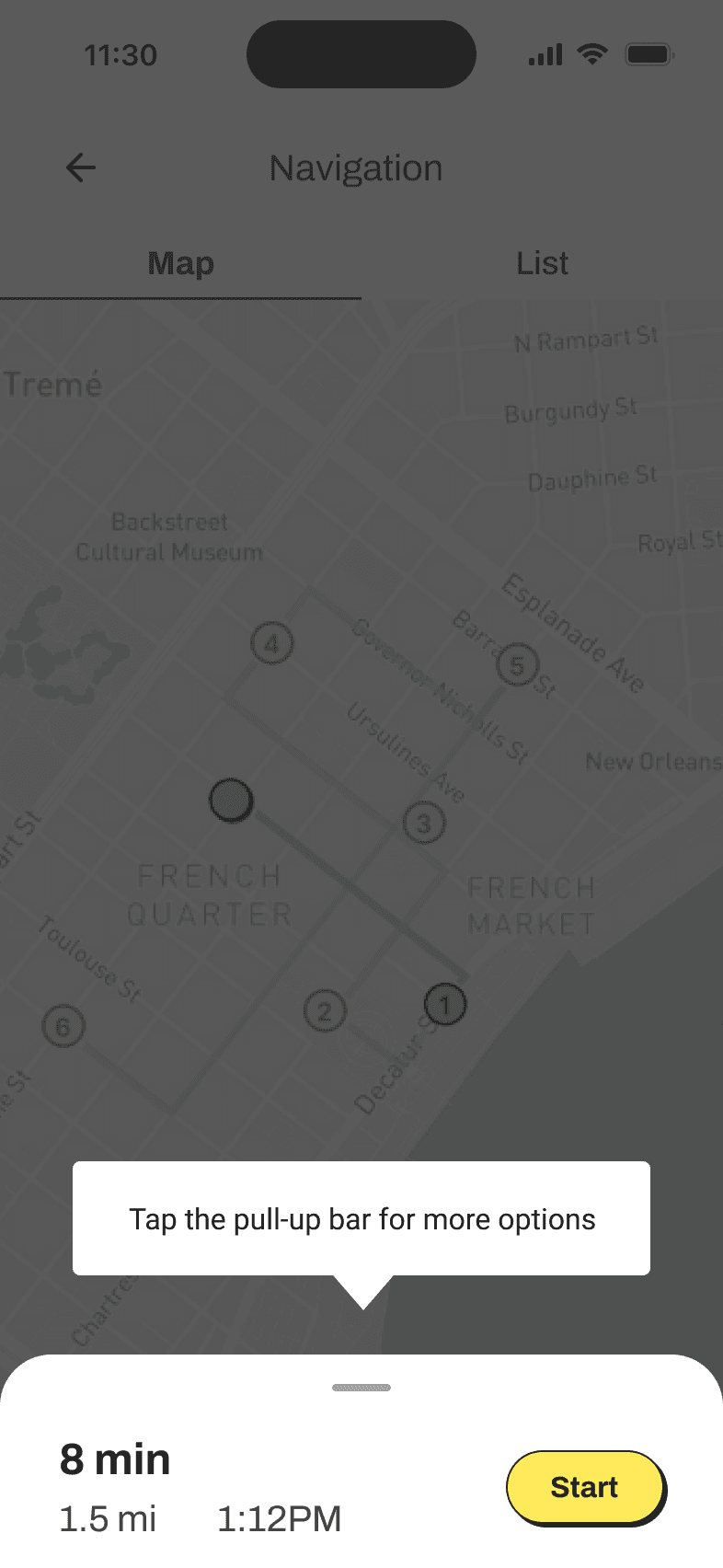
Users struggled to find the option to add a meet-up point in the map view of the navigation tab. This option is available in a drawer at the bottom of the screen that the users can tap to open.
Users struggled to find the option to add a meet-up point in the map view of the navigation tab. This option is available in a drawer at the bottom of the screen that the users can tap to open.
Before:
Before:
Open the drawer in map view in the navigation tab.
Tap “add meet-up point”
Open the drawer in map view in the navigation tab.
Tap “add meet-up point”


Possible solutions
Possible solutions
Possible solutions
Possible solutions
01 Drawer Open by Default
01 Drawer Open by Default
When the user opens the navigation tab for the first time, the drawer with the “add a meet-up point” option is open by default. The user can collapse it if they don’t intend to do any of the actions in the drawer.
When the user opens the navigation tab for the first time, the drawer with the “add a meet-up point” option is open by default. The user can collapse it if they don’t intend to do any of the actions in the drawer.
02 Tooltip
02 Tooltip
When the user opens the navigation tab for the first time they’ll be given a tooltip to help them locate the “add a meet-up point” feature and other features hidden in the drawer.
When the user opens the navigation tab for the first time they’ll be given a tooltip to help them locate the “add a meet-up point” feature and other features hidden in the drawer.
Proposed next steps
Proposed next steps
Proposed next steps
Proposed next steps
Option 1 requires fewer steps to implement. However, to determine the best solution to the problem I would do another round of usability testing with these two options. A closer look at the users' mental models and time spent on screen would help determine the best solution.
Option 1 requires fewer steps to implement. However, to determine the best solution to the problem I would do another round of usability testing with these two options. A closer look at the users' mental models and time spent on screen would help determine the best solution.
Next Steps
Next Steps
Next Steps
Features
Features
Features
Due to time constraints, the scope was limited to only designing some of the features of the app.
That being said, if the time allowed I would have like to design additional features in the near term, and offer solutions in other areas of city travel in the long term.
Due to time constraints, the scope was limited to only designing some of the features of the app.
That being said, if the time allowed I would have like to design additional features in the near term, and offer solutions in other areas of city travel in the long term.
Short Term
Short Term
Short Term
Short Term
In the short term, it would be most beneficial to develop features that help users feel safer when traveling. While the MVP offers live location sharing, there could be other features, such as safety tips for example, that could help put users at ease when traveling.
In the short term, it would be most beneficial to develop features that help users feel safer when traveling. While the MVP offers live location sharing, there could be other features, such as safety tips for example, that could help put users at ease when traveling.
Long Term
Long Term
Long Term
Long Term
In the long term, it would be helpful to think about expanding the scope to include cities outside the US. This would mean offering the app in more languages, to ensure it is accessible to a wider audience.
In the long term, it would be helpful to think about expanding the scope to include cities outside the US. This would mean offering the app in more languages, to ensure it is accessible to a wider audience.
Key Takeaways
Key Takeaways
Key Takeaways
The end-to-end travel app design didn’t come without its challenges, but I am proud of the project and the work I accomplished in 6 weeks.
The end-to-end travel app design didn’t come without its challenges, but I am proud of the project and the work I accomplished in 6 weeks.
Opportunities for Improvement
Opportunities for Improvement
Opportunities for Improvement
Scope Creep
Scope Creep
In this feature-rich product, I found it difficult to narrow down features for the MVP. The research participants when interviewed offered a wealth of opportunities to explore in this project, making the project more interesting, but also potentially adding a long list of features to develop for the MVP. With the help of my mentor I was able to re-prioritize features and find key task flows to focus on.
In this feature-rich product, I found it difficult to narrow down features for the MVP. The research participants when interviewed offered a wealth of opportunities to explore in this project, making the project more interesting, but also potentially adding a long list of features to develop for the MVP. With the help of my mentor I was able to re-prioritize features and find key task flows to focus on.
Staying organized.
Staying organized.
During this project, I managed to improve my process by incorporating an organization strategy. With a robust folder structure for each stage of the project and tidy Figma files, I kept good track of all my deliverables making content writing for the case study a lot more straightforward this time around.
During this project, I managed to improve my process by incorporating an organization strategy. With a robust folder structure for each stage of the project and tidy Figma files, I kept good track of all my deliverables making content writing for the case study a lot more straightforward this time around.
Successes to Celebrate
Successes to Celebrate
Successes to Celebrate
Asking for feedback early and often.
Asking for feedback early and often.
In this project, I had a chance to do usability testing with mid-fi wireframes in addition to testing high-fi wireframes. The feedback I received from testing proved to be a huge help in creating a robust navigation system and a friendly UI.
In this project, I had a chance to do usability testing with mid-fi wireframes in addition to testing high-fi wireframes. The feedback I received from testing proved to be a huge help in creating a robust navigation system and a friendly UI.
Following a framework.
Following a framework.
Embracing the Design Thinking framework provided a structured approach, guiding me through empathizing with travelers, defining the specific challenges, ideating creative solutions, prototyping, and testing. This process allowed me to address the unique needs and preferences of city travelers for a more effective and enjoyable user experience.
Embracing the Design Thinking framework provided a structured approach, guiding me through empathizing with travelers, defining the specific challenges, ideating creative solutions, prototyping, and testing. This process allowed me to address the unique needs and preferences of city travelers for a more effective and enjoyable user experience.